LaunchDarkly is a feature management platform, allowing product teams to release features quicker, reduce risk in their releases, and create experiments in live code using a software engineering technique known as feature flagging. I was the design lead for the the Feature Workflows squad, focused on the platform's workflow and automation capabilities.
I joined the team shortly after they released Approvals, enabling enterprise product teams to request and grant approval to make flag changes. For example, a product manager might request approval from an engineering manager to turn on a new feature in their team's production environment. The engineering manager would be notified of the request via email and be taken to LaunchDarkly to approve the request, providing the go-ahead to make the changes. Upon approving the request, either the PM or EM can apply the changes, making them live on their application.
Below was the first iteration of the approval request page.
The approval request page at the start of this project, ripe for a redesign.
The page had quite a few IA, interaction, and visual design issues, cataloged in a spec doc by my PM, which served as the springboard to my work on the project.
Screenshot of pain points from spec doc
I quickly got to work understanding how the screen is used via virtual whiteboarding sessions with my PM and Engineering counterparts (LaunchDarkly refers to this as the "triad") and started to form a mental picture of the job each component does, visualized below.
With that, I started to reimagine the components on the page, focusing on visual hierarchy using lo-fi mocks uploaded to Figma and shared via Zoom or Slack.
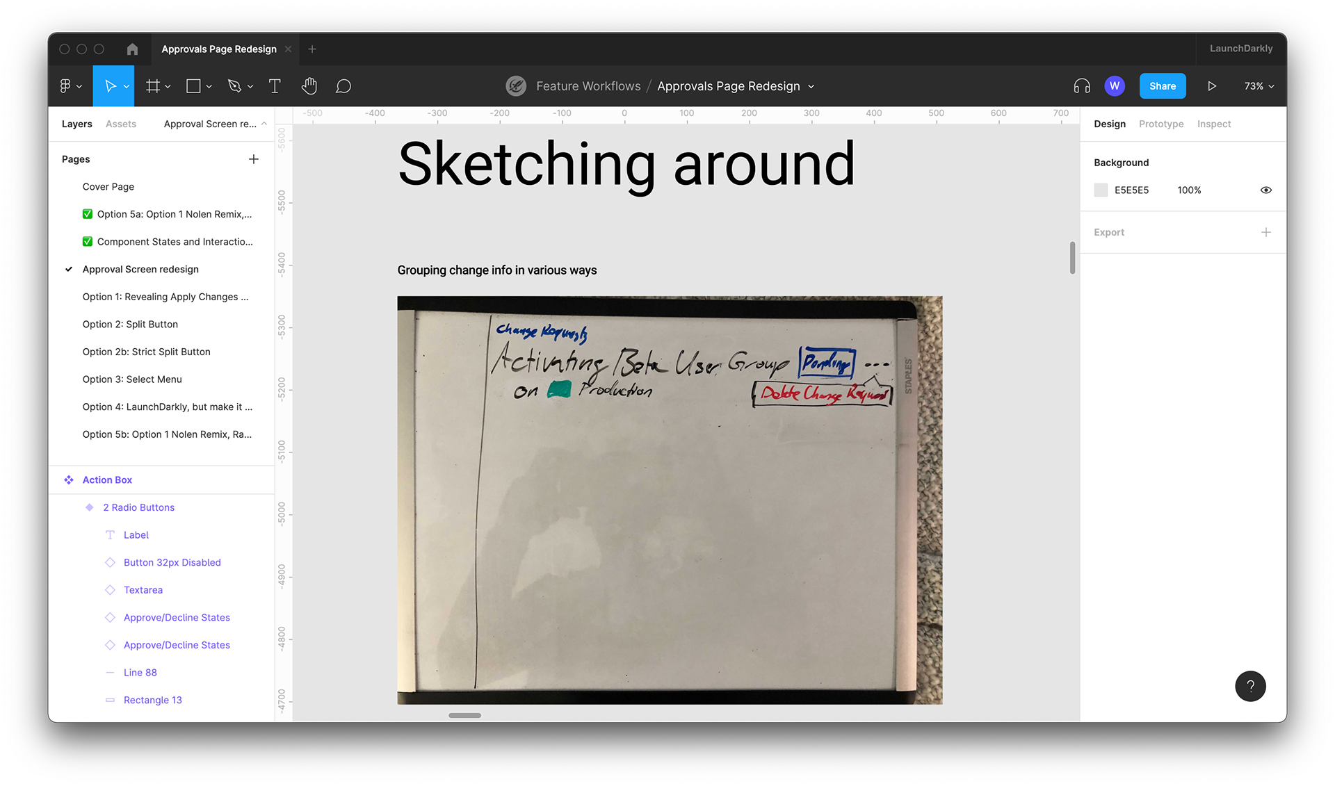
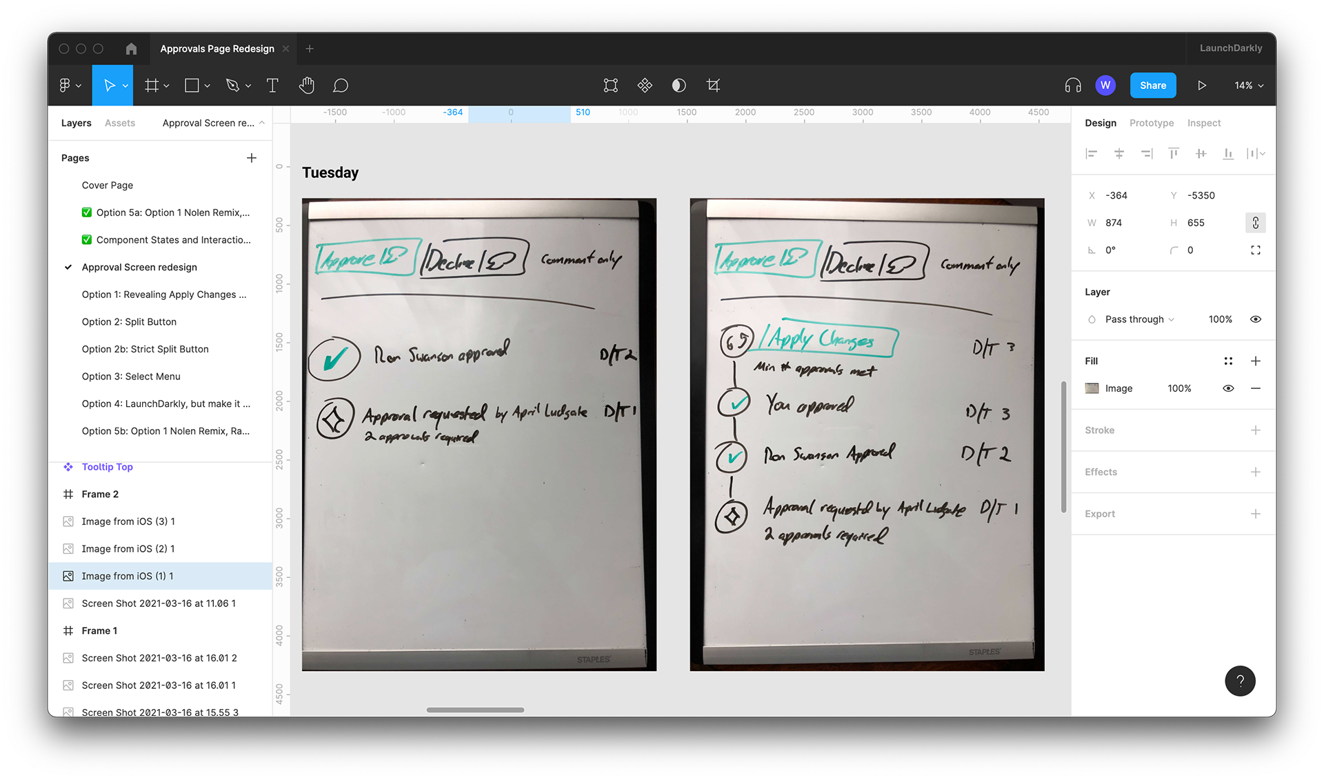
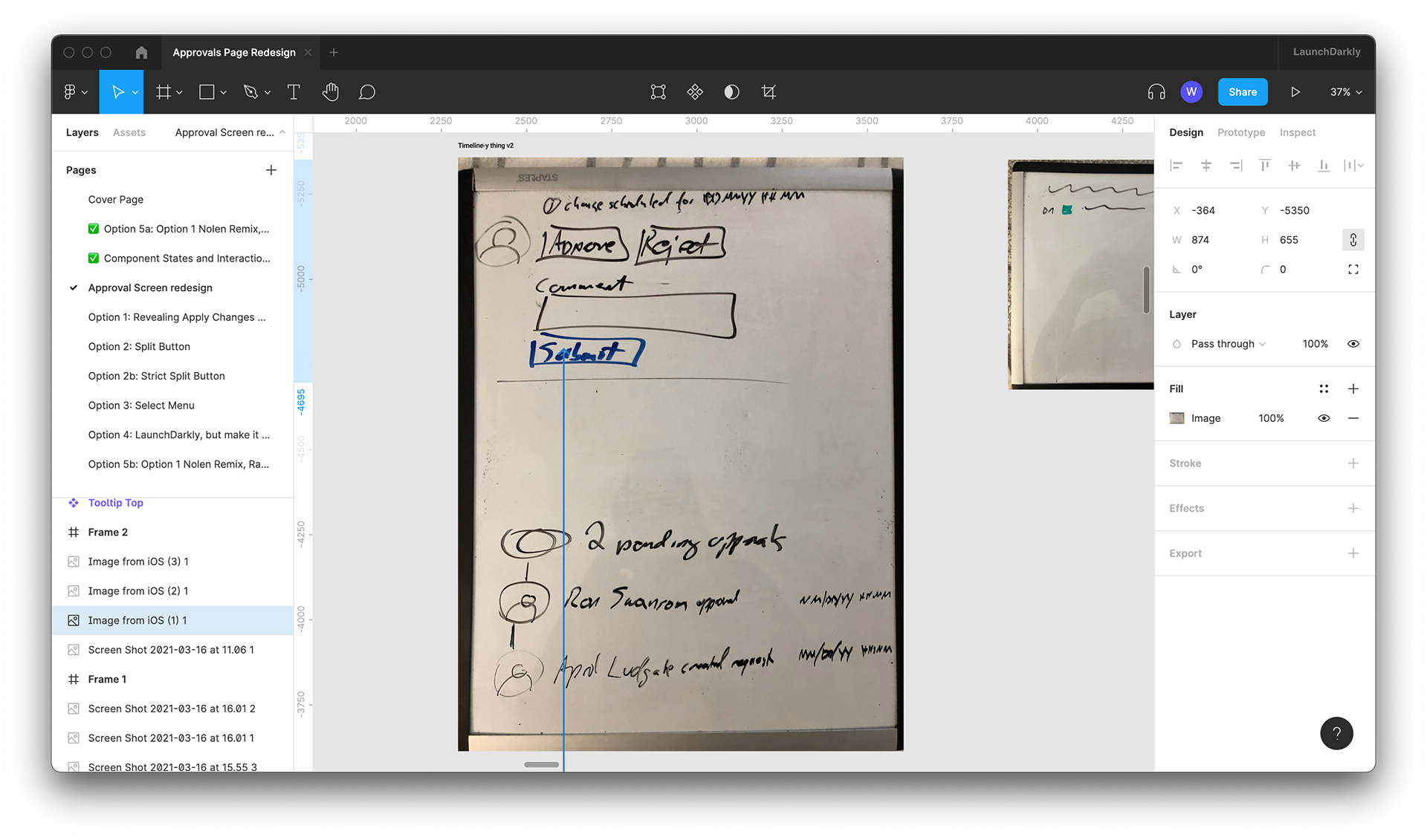
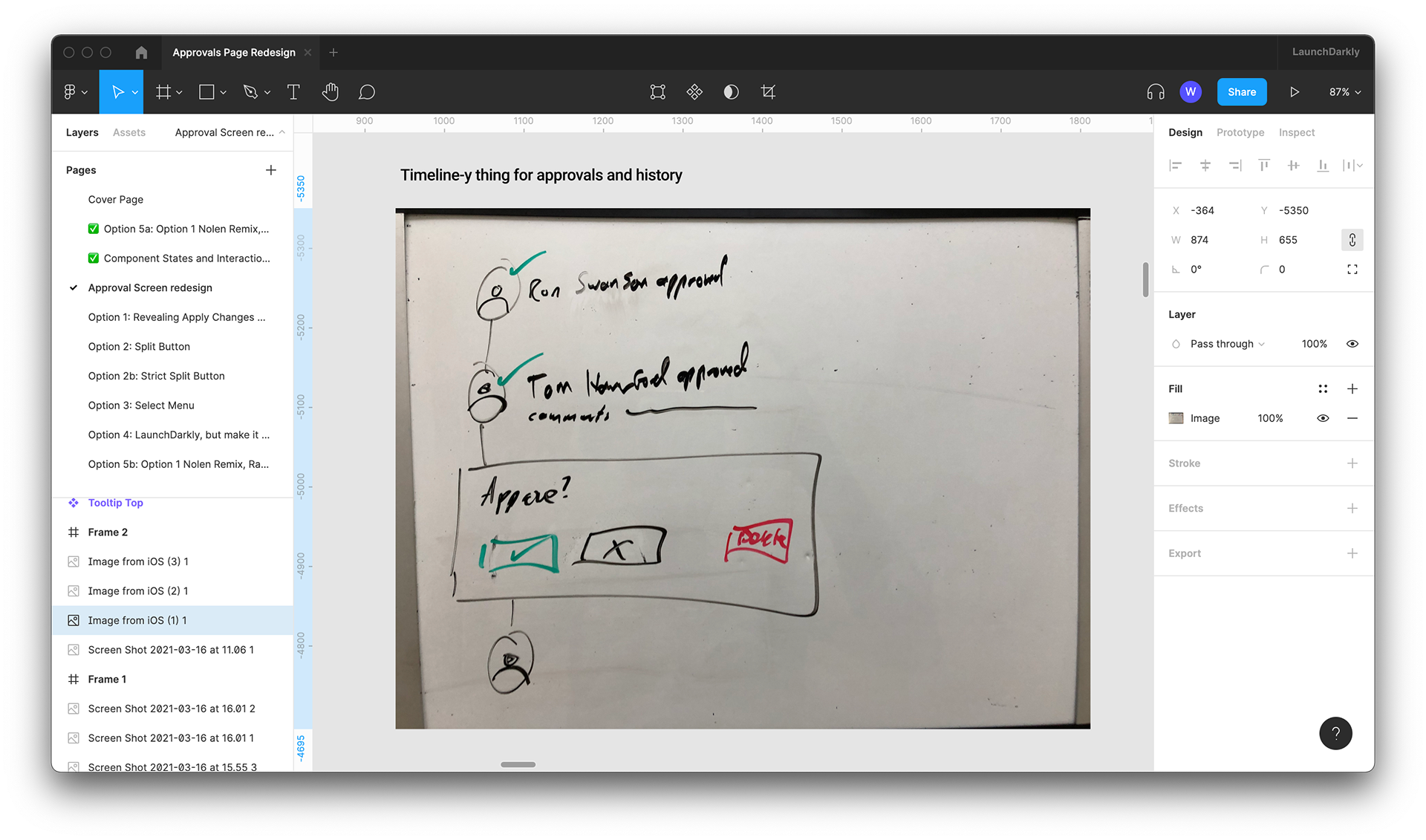
Once the team felt aligned on approaches for individual components, I created a new mid-fi mockup of a new layout so we could see how these parts could fit together.
The "Add Review"/review form area proved to be a tricky interaction. It's not immediately clear from the first build of the page that one can take 5 actions there (approve, approve with comment, decline, decline with comment, and only comment), despite only having 3 radio options. Moreover, the "Apply Changes" button, which actually changes the state of the flag per the request, was placed far away from these controls in the top right corner of the center column and is frequently missed by customers. The team agreed that it was important for all of these controls to live together, so I worked on 5 options for grouping them together.
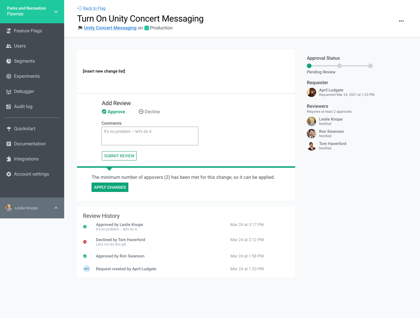
The "Apply Changes" option appears only when the required number of approvals have been met
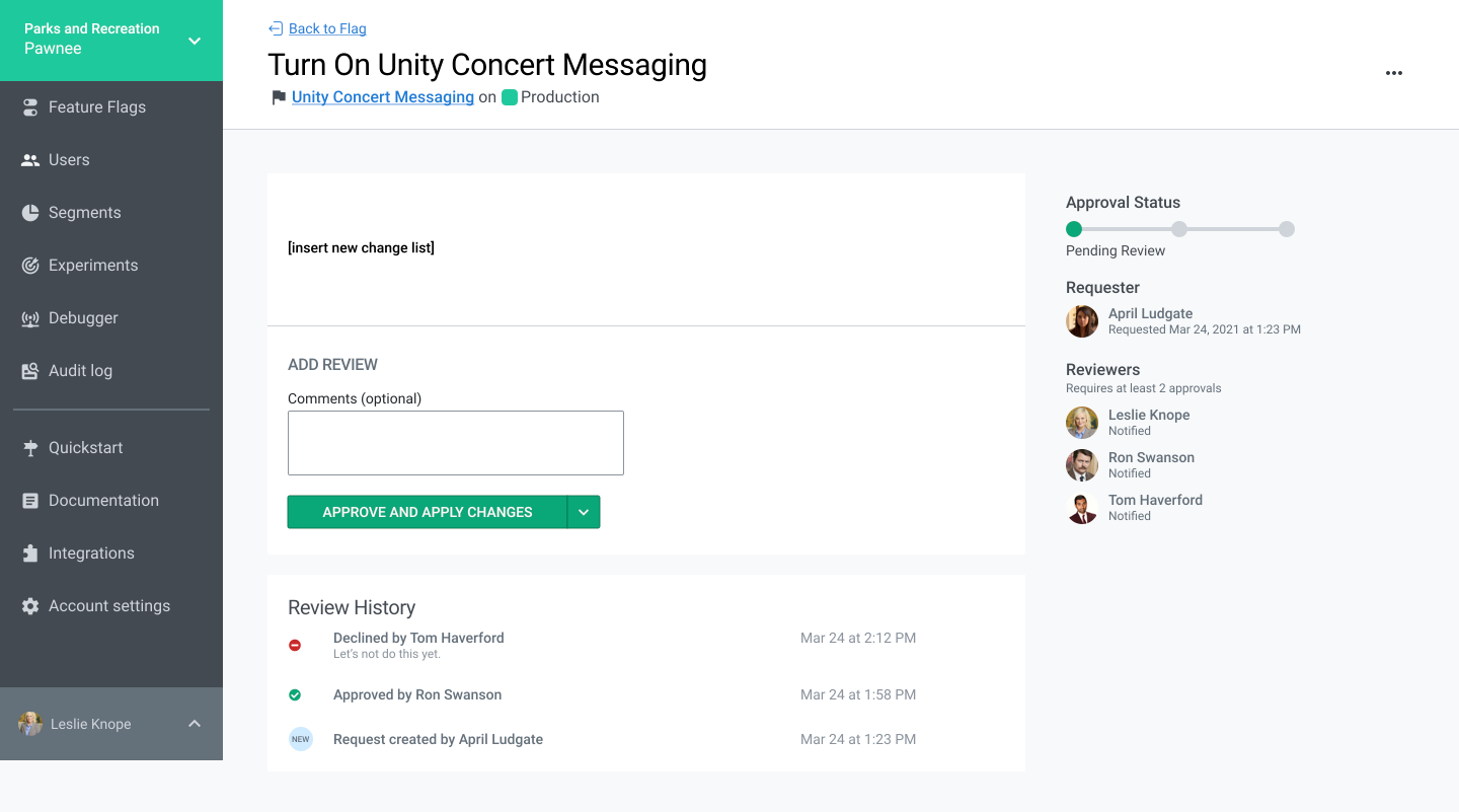
All review options are contained within a split button.
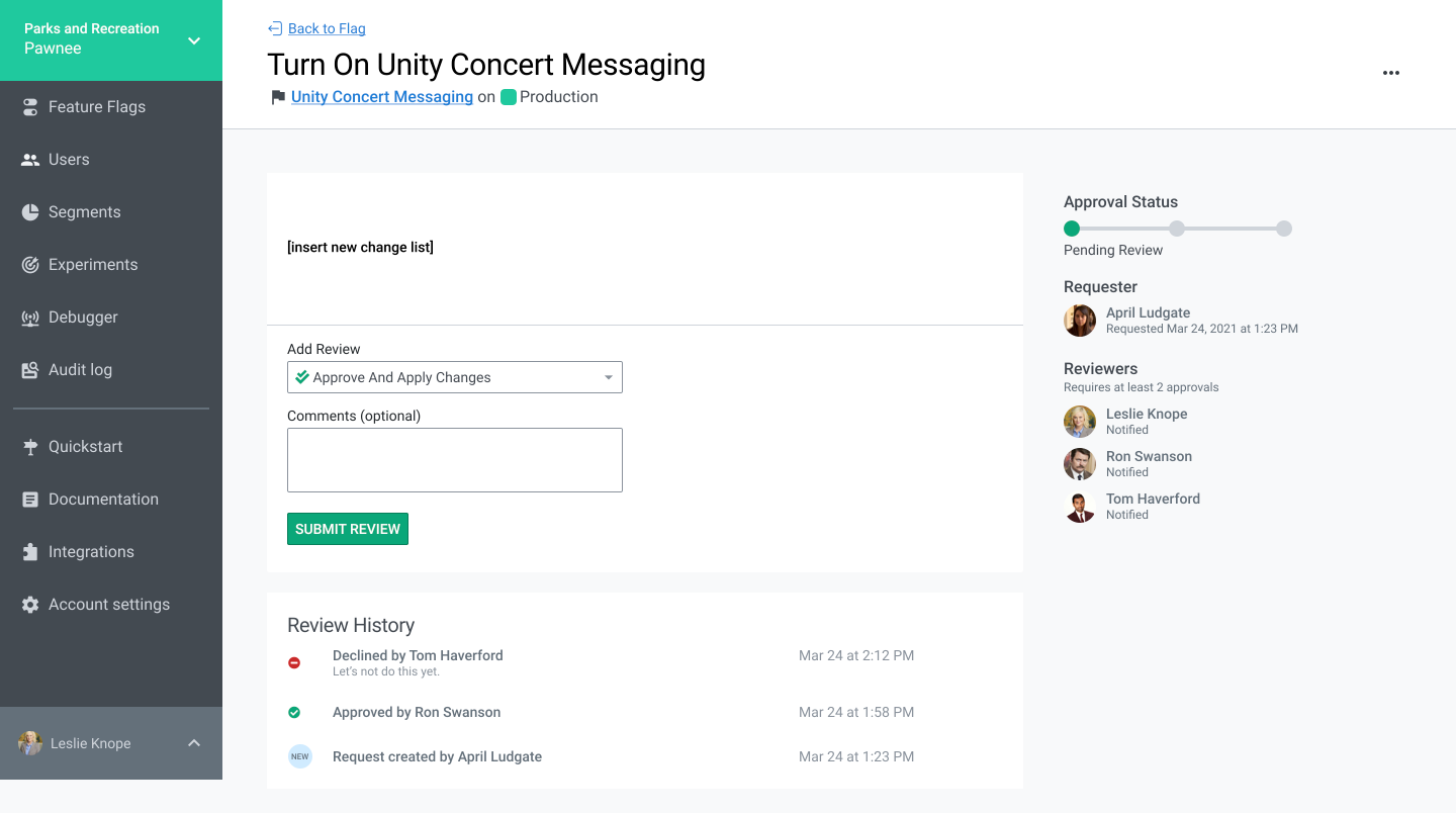
A drop down select menu with review options
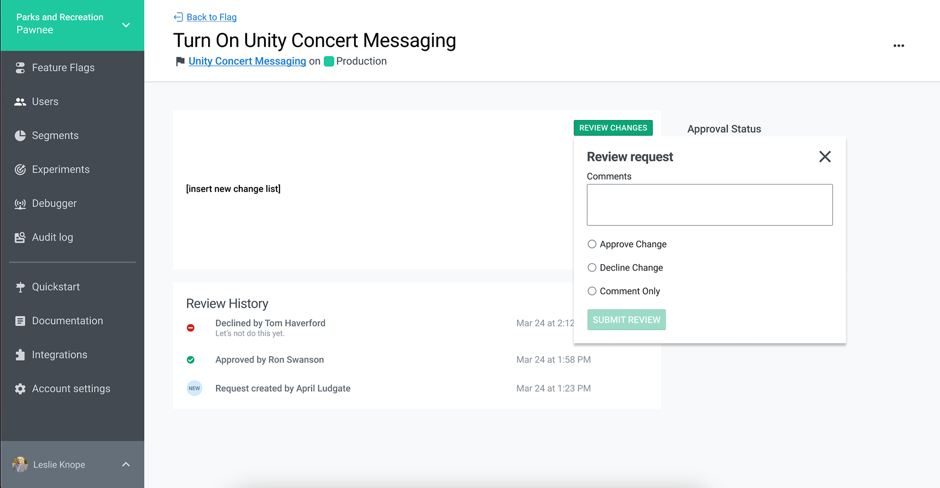
A GitHub style Review Changes popover menu
A split button that contains "Approve and Apply Changes" and "Approve" plus a separate "Decline" button
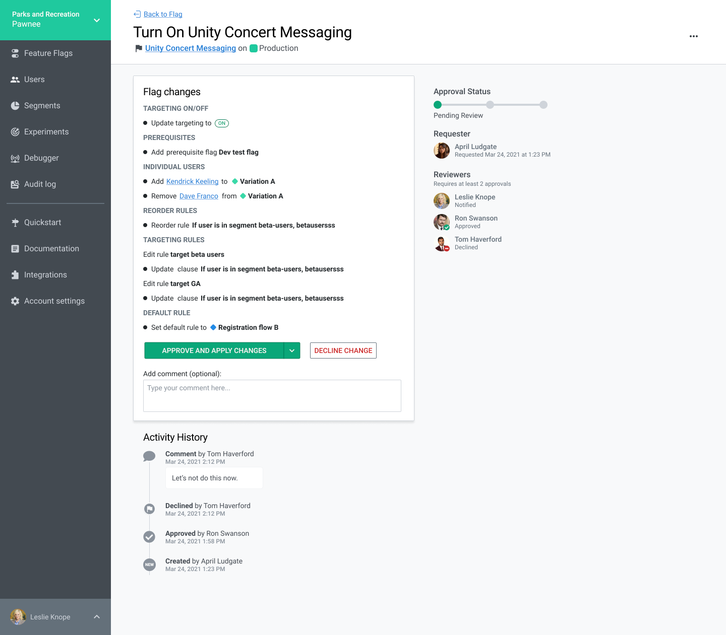
Through feedback in internal product channels, accessibility considerations, and a nudge from our VP of Product and Engineering, we chose the option that contains a split button for "Approve" and "Approve and Apply" and a dedicated "Decline" button. If not enough approvers have approved the request, the button would default to "Approve" and "Approve and Apply" would be grayed out as an option, explaining that # of remaining number of approvals are needed. Once numRequiredApprovers-1 have approved, the button would default to "Approve and Apply", allowing the approver to approve and apply the change immediately. Below is a larger view of that option in a high-fidelity mockup of the page.
My high-fidelity mockup of the redesigned Approval Request page.
The engineering team consulted with the triad over the course of development, filling in error, null, and other states, and in about 2 months, we had a new approval request page!
The new Approval Request page in use today.
This project was a great opportunity to learn about the multiplayer nature of flag change management and to exercise my IA and visual design chops as a first project at LaunchDarkly.

