Update (1/12/2019): Corteva.com has won some awards!
• 2019 WebAward for Outstanding Achievement in Web Development
• Transform Awards North America 2019 Best Rebrand of a Digital Property (Bronze)
• 2019 WebAward for Outstanding Achievement in Web Development
• Transform Awards North America 2019 Best Rebrand of a Digital Property (Bronze)
Problem Statement
As part of Dupont and Dow Chemical’s multi-billion dollar merger in 2017, the combined entity announced the formation of Corteva Agriscience (codenamed AgCo), an agriculture-specific company consisting of Dupont’s crop protection division, their Pioneer seed brand, and Dow’s agriscience division. Corteva contracted SapientRazorfish to help them define a multi-year digital strategy and roadmap to become the most farmer-centered company in agriculture. I was responsible for envisioning future-facing experiences for farmers and leading the experience design of their brand new corporate and commercial websites.
Envisioning Agriculture’s Future
I joined the account about halfway through the initial research and strategy project, where we learned about farmers’ behaviors, pain points, and journey throughout the farming year. I participated in the synthesis and presentation of research findings, with an eye towards how envisioning how farming could be transformed through cutting-edge digital experience.
One of the biggest findings from the research phase is that farmers needed to be simultaneously mindful of the performance of their crops in the field, the health of their farm as a business, and external considerations such as government regulation and public perception of farming as an industry. This juggling act was captured by 3 farmer “mindsets”, personas farmers need to take on as part of their work.
An farmer’s Field mindset, describing the needs and challenges and mindset-specific behaviors across a farmer’s Plan - Plant - Grow - Harvest journey.
As the research phase was winding down, I was up to help drive concepts to illustrate a farmer-focused digital future for Corteva. One of the central tenets of the experience design was an idea of a centralized customer data profile that lent itself to expression across whatever channel a farmer chose to interact with Corteva.
A sample lineup of an ecosystem of expression points for farmers interacting with Corteva. I worked on the business intelligence tool (iPad, second from left), a mobile app (iPhone, third from left, front), a What’s App-based chatbot concept (iPhone, fourth from left, front), and a social media platform (iPad, right)
We learned that many farmers use What’s App to communicate with each other around growing conditions and other community matters. Given Facebook’s investments in AI across its properties and farmers’ needs discovered through our research, I explored a “what-if” concept of a What’s App-based digital assistant that could provide help farmers throughout the year. Since famers work closely with their local agronomists and retailers, Corteva would whitelabel the assistant to them, but have the agronomists and retailers themselves available for additional consultation.
A sample script and experience I developed for the What’s App chatbot concept. You can scroll through the prototype here.
Some notable experience points:
• During the Planning phase of the journey, the chatbot can access the centralized customer data profile to see previous year’s performance and make product recommendations based off of that information.
• Inspired by What’s App’s plan to introduce peer-to-peer payments in the app, I introduce the ability for farmers to pay for supplies through What’s App.
• We learned that famers have a hard time staying aware of government regulation surrounding the active ingredients used in their crop protection products, so the chatbot can proactively offer updates on active ingredients used in their farms from trusted sources to ensure that they stay in compliance of regulation.
• During the Growing phase of the journey, the farmer could take and send pictures of diseased crops to be instantly diagnosed using machine-learning based image recognition. If the diagnosis requires a field visit from the agronomist, it can be schedule right through the app, being knowledgeable of available appointment times.
• It can also keep the farmer up-to-date on news and events that might be relevant to him/her.
This, along with a few other experience concepts I designed, helped Corteva envision a farmer-focused future and lay a multiyear roadmap of projects and technical capabilities needed to fulfill that future. And while these experiences may not be manifested exactly as shown in What’s App, the concept helped identify the underlying capabilities and features to help support farmers on their journey.
Designing the Corteva Website
But naturally, a new company first needs a new website, so the first step on our roadmap was to get a new website up and running. In collaboration with our content strategists, our business requirements team, and the client, we first identified a sitemap needed to support the types of information farmers are looking for. Chief among those needs is product detail information; as it turned out, the design of the product detail pages proved to an interesting intersection of user needs, technical capabilities, and business requirements for this nascent company.
The merging of these companies meant unifying different approaches to these former competitors’ product information. Dupont traditionally used their product detail pages as marketing materials while Dow used them as reference material for farmers in the field. Incidentally enough, these approaches roughly corresponded to the Business and Field farmer mindsets respectively, so I wanted to explore the opportunity to support both journeys when designing these pages.
As we had done throughout the design of these website, I used the wireframes to help align both internal and client stakeholders and drive requirements. Additionally, I began working on the mobile viewport first, since we also learned that farmers are heavy users of mobile devices. Some design considerations I was mindful of:
1. As mentioned before, how to best support the “product detail page as reference material” journey and “product detail page as marketing material” journey?
2. Given that these products are purchased through local representatives, what’s the best CTA Corteva can support while the company is forming its retailer network?
3. How to best corral the wildly variable number of weeds/pests/diseases each product is applicable for?
4. Since the client identified a set of required and optional fields for each product (and not each product will have all or any of the optional fields), what’s the best way to lay out the information to minimize variability in the page layouts?
Supporting both journeys informed the “header” of the page. It consisted of the product’s name (naturally), its category (herbicide, fungicide, etc), a brief description of the product, and two CTAs that correspond to the two journeys. Finding a Representative supports the business journey to buy the product and the Quick Links support the Field journey, providing quick access to labels and material safety data sheets, which are basically instruction manuals for using the product in a farmer’s field. With this setup, pathways to continue either of the farmers’ journeys are presented front and center, with no need to search and scroll for this information.
However, that exact CTA was still up in the air as Corteva was forming their representative structure. I initially led with a version with a prepopulated zip code field based on the user’s location, modeling the interaction after "dealer-based" sales models, such as auto sales or insurance.
During our client review, we learned that their data source for representatives wasn’t finalized yet with location information per representative, preventing us from using any sort of location selection prior to viewing reps (this also negated an option I had using city and state instead of zip code). So for now, we reverted to a simple Find a Representative button to send farmers to a static representative directory; enhancing the CTA with a location selection was marked as an enhancement and placed in the backlog.
During our client review, we learned that their data source for representatives wasn’t finalized yet with location information per representative, preventing us from using any sort of location selection prior to viewing reps (this also negated an option I had using city and state instead of zip code). So for now, we reverted to a simple Find a Representative button to send farmers to a static representative directory; enhancing the CTA with a location selection was marked as an enhancement and placed in the backlog.
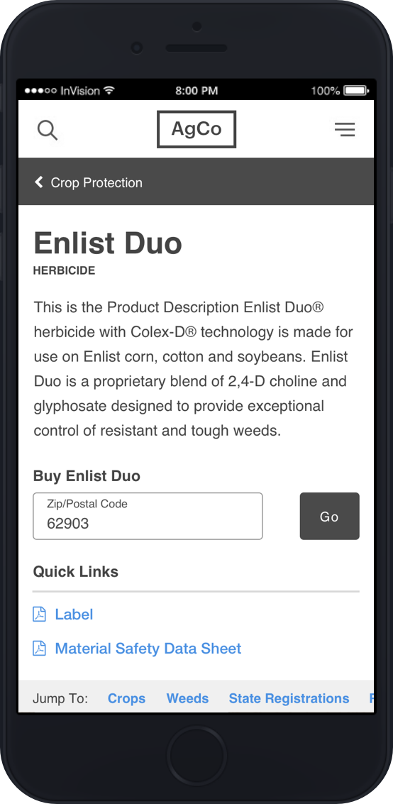
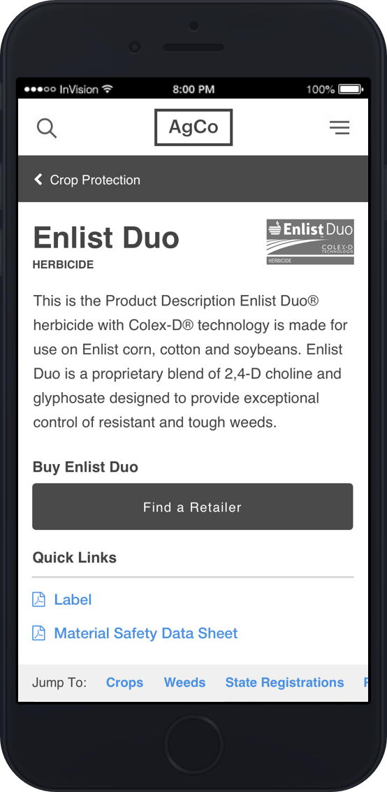
The header of the product detail and the two CTA options for the Business/sales journey
Being able to reliably display a large set of weeds, pests, and diseases for each product also proved to be an interesting challenge. With products that are effective against 100+ weeds, I needed a way to display this information without overwhelming the page.
• My first attempt at this was to simply summarize the number of weeds a product is effective against and list 3 highlights. It proved to be not enough information per the client’s opinion and the visual designer I was working with felt it didn’t give her enough to present the information effectively.
• Attempt 2 involved hosting the full list in a fixed height scrolling list with a search box. In order to do this, I needed to introduce a tap/click shield to only scroll the list after it’s been clicked/tapped into focus. This proved to be a bit over-engineered, especially since it would add a toll on content creators to ensure that the list is updated as products are updated.
• The option that proved most successful ended up being an extension of my first attempt. I slightly reformatted the text and allowed for up to 10 weeds to be displayed in a list. Additionally, the full list of weeds is always available in the label PDF, so I introduced a link to it as another way to access it. This approach felt most inline with a progressive disclosure display model and worked well for both the client and the team’s visual designer.
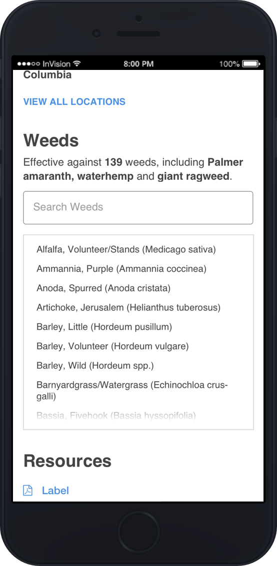
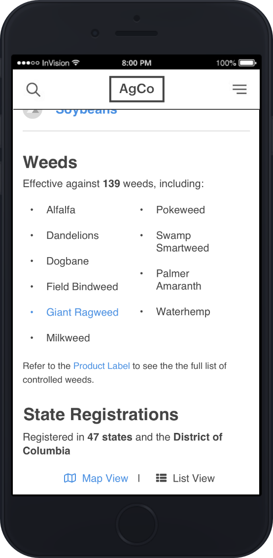
Options 2 and 3 of the weed list (I must've deleted Option 1).
We’re planning on usability testing these designs with farmers to get their feedback, which we’ll prioritize and modify the designs accordingly within our project plan. Below is where I ended up with the "basic" version of the product detail page in both desktop and mobile viewports.
Next Steps
As of Spring 2018, we’ve finished up the designs and are looking towards a summer launch of cortevausa.com With it being our first release of the US commercial site, we’ll look to improve and enhance it based off of analytics, our backlog of capabilities, and feedback from farmers over time.

